Topseller
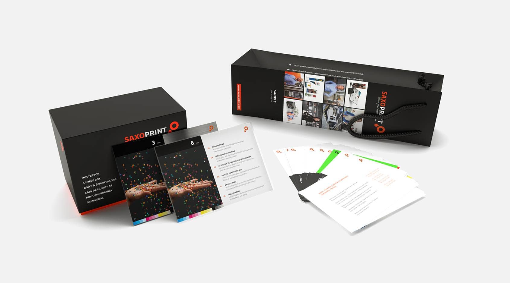
Branded or Neutral Product Samples
Our product samples give you a good overview of our products and the selection of materials available to you. If you are a reseller, you also have the opportunity to impress your customers with the quality of our products thanks to the neutral sample versions.
See Product SamplesYour Benefits for Online Printing at SAXOPRINT
Customer advice is important to us. Our expert employees are available from Monday to Friday to provide you with prompt answers to your questions and offer customised solutions based on your requirements.
You can view all of the prices in our online shop. Delivery fees are always included in the price. You can also download your product configuration as a PDF file and save it as a quotation with a 14-day price guarantee.
Using cutting-edge printing technology, we reduce our CO2 emissions by 70%, compared to conventional printing processes. In collaboration with ClimatePartner, you can have your products printed using a climate-neutral process and do your part to protect the environment.
For every order, we make sure your templates are suitable for printing free of charge. If any alterations need to be made, we inform you by email.
 Climate neutral transport
Together with DHL and DPD, we invest in reducing and offsetting the CO2 emitted during transport.
Flyers, folded leaflets and brochures can be offered VAT free under certain conditions. You can select VAT in the calculation in the Service section.
SAXOPRINT A Customer-Focused Online Print Shop
At SAXOPRINT, the critical metric for success in running our business is how we add value to you, the customer. We have been in the printing business for 20 years and provide services that allow you to both design and print online. We maintain high standards for all products and services to fulfil your unique needs. From personalised flyers, striking posters, giveaways, professional business cards, folded leaflets, and much more.
Our online print and design shop is intuitive, easy-to-use and delivers highly professional results, meaning you get the most out of the money you put in: High service quality paired with the ability to design and print a whole range of products.


Our Most Popular Products
- Flyers
- Giveaways
- Posters
- Folded Leaflets
- Business cards
- Greeting cards and postcards
- Food packaging
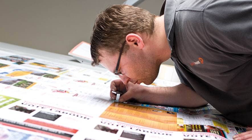
Flyer Printing
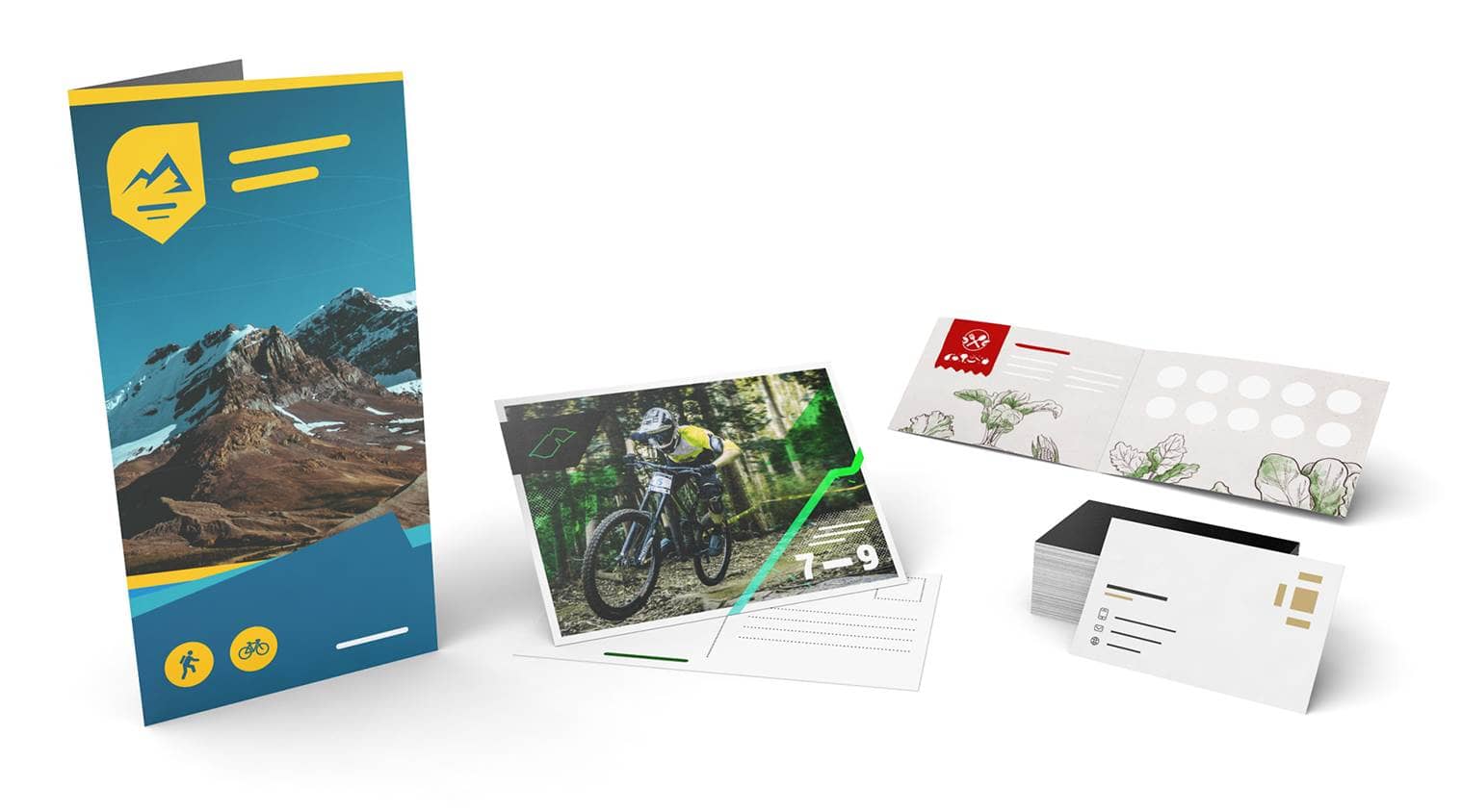
Do you need some stunning flyers for your next guerilla marketing campaign? We have you covered. Choose between a range of formats. Our flyers can be folded or unfolded, allowing up to 12 different sides. If you want a glossy finish, UV coating, or lamination, to build the perfect flyer for your advertising campaign, use our online store.
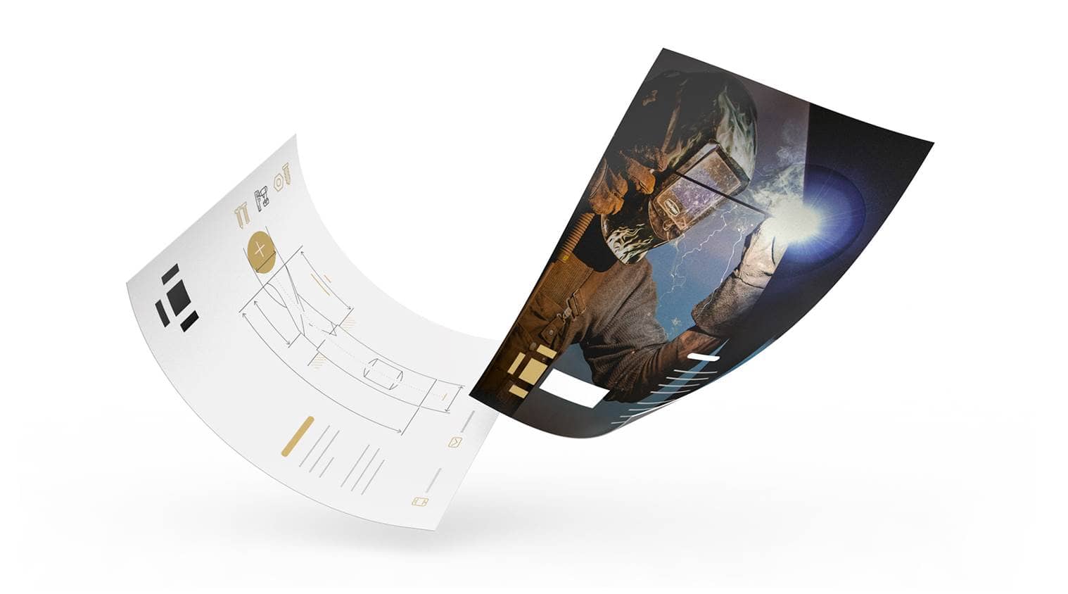
Poster Printing
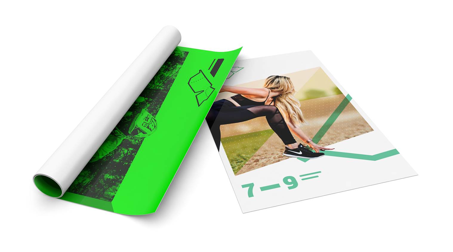
Poster advertising remains a bedrock of any comprehensive marketing campaign. We offer seven different materials perfect for indoor and outdoor installations. See how beautiful your brand looks displayed over 150 x 70 cm with a fresh, clean finish.
Business Card Printing
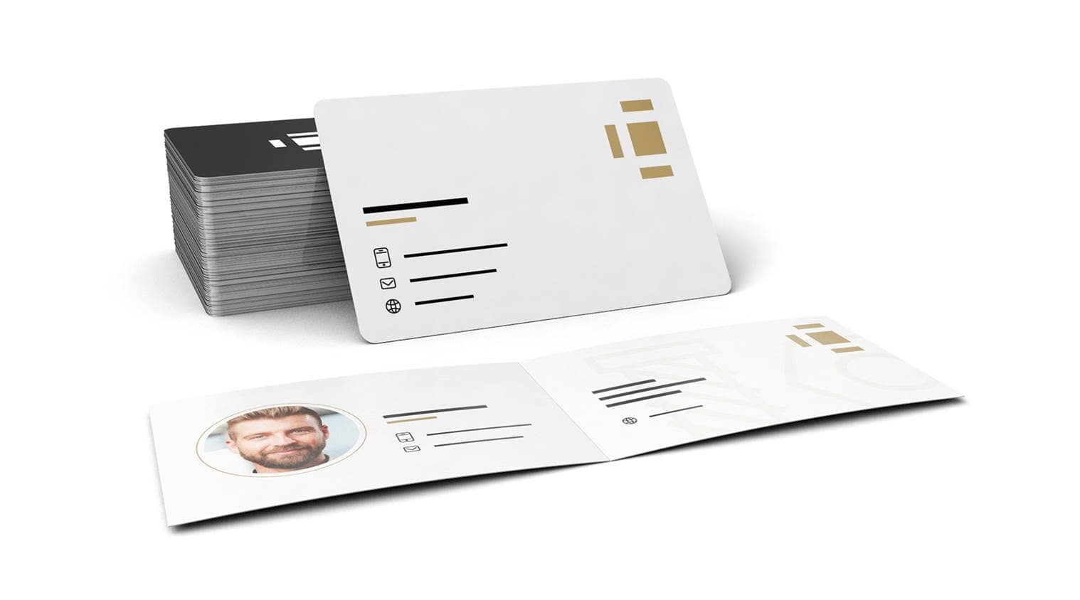
Freshen up your networking evenings with some trendy new business cards.
- Standard or folded business cards
- Up to 450gsm cardstock
- Spot colours and print finishing available
Greeting Card Printing
Showing customer appreciation has never lost importance. Send a personalised greeting card to say thank-you. Remind your best customers that you appreciate their business with custom messages which are easy to create with individual online printing capabilities.
Food Packaging Printing
Your restaurant need packaging for to-go orders? At SAXOPRINT you can print food-safe packaging with your individual design and logo. We are well-versed in the needs of B2B companies. We provide advertising materials without scuffs and colour bleeding. If you are a creative agency, individual marketer, or someone who wants a partnership with a top-quality printing company, then join the SAXOPRINT Pro programme, we have great solutions if you choose to design/print all advertising materials in one place.
Individual Packaging Printing
We have the right tools to make the printing of your packaging fast and easy. With our printing templates, it is easier than ever to create your personalised packaging. Our templates allow you to create individual artwork without all the hassle.
Delivering high-quality products is of utmost importance for us. You have timelines and budgets to follow, so keeping our production costs low has been a priority for SAXOPRINT since day one, which means we can pass along those savings to you, the customer.

SAXOPRINT Online Printing
We know budget constraints are a significant factor when choosing a print service partner, and we take pride in helping our customers solve problems. So, we keep our printing service team ready to jump in providing practical assistance Monday-Friday by phone or email.
The times are always changing, and so do the needs of your business. We keep a lean-agile mindset to stay on top of best practices while continually innovating our services. Whether you need small or large print runs, SAXOPRINT is here to help you. We specialise in high quality printing in various products and different quantities.
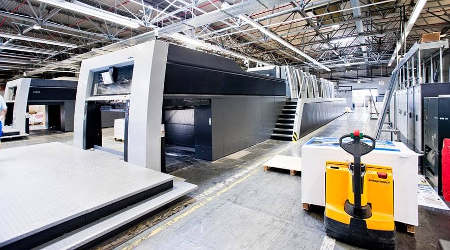
We ensure quality because it’s the name of the game in the printing world. We have invested in top-of-the-line printers to provide maximum customer value. For example, we use the Heidelberg Speedmaster XL 162 which is an offset printer built for the most accurate registration and quick-set-up on the market today.
SAXOPRINT works in an environmentally conscious way by using eco-friendly materials and following a consistent print regiment to cut down on emissions. When it comes to sustainability and the well being of our planet, we implement these practices into every aspect of our business. We source all materials through conscious-minded vendors while developing our internal operations to have as little environmental impact as possible. SAXOPRINT strongly believes in a clean planet for all of us to enjoy.


